If Disney Princesses Were Brand Founders: 8 Mini Branding Case Studies
Have you ever wondered what the Disney princesses would do with their lives after they found their happy ending, married their prince and had their wish upon a star come true?
Well, I have and of course, I turned them into successful female entrepreneurs each with their own business and branding that reflected their unique princess essence!
So I’m going to break down my thought process behind each of the mini brands that I’ve created for them so that you can learn a bit more about what makes a great brand that reflects your uniqueness.
*All characters belong to Disney*
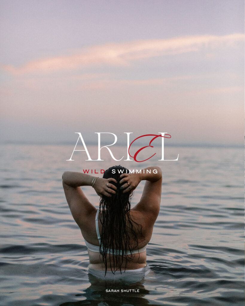
1. Ariel: Wild Swimming
When creating a brand for Ariel, two things felt very obvious to me.
Firstly, the business has to revolve around wild swimming because she was a mermaid and I had to find a way to incorporate the colour red because her hair is a signature feature of her appearance.
Naturally, this led me to use red as the accent colour for the brand. I wanted to get creative with how I used this accent colour so I decided to make the ‘E’ in ‘Ariel’ a signature feature of the logo. Changing the colour to red helped this to stand out but I also played around with the font to give the E a lot of movement. Like the movement that her hair has in the water.
This is just one example of how you can take a key feature of your personal style and reflect it seamlessly into your brand!
2. Snow White: The Hit Podcast
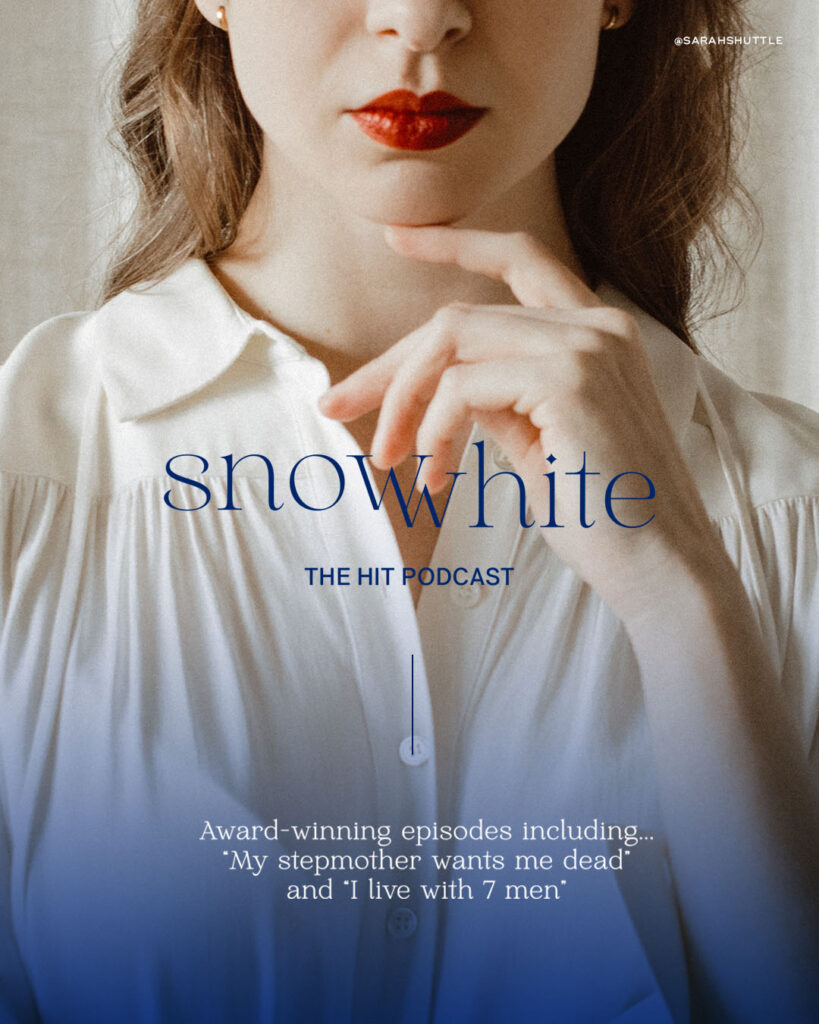
I know what you’re thinking, Snow White doesn’t automatically make you think about podcasting but when you build up the branding around it, suddenly it makes perfect sense! I just know this woman would have a lot to talk about.
The image was really important for this branding so when I saw a woman with a red lip and a white shirt, I knew I had to use it. I then added a blue overlay to add a bit more dimension to the picture and reflect the 3 core colours associated with Snow White!
For the font I wanted it to feel both fun and empowering and still keep that fairytale essence. Keeping it lowercase with the accents and the star above the ‘i’ helped me achieve this.
The additional copy also helped bring this brand together. The second I added the podcast episode titles, it became very clear how she could have a hit podcast!
3. Jasmine: Travel Diaries
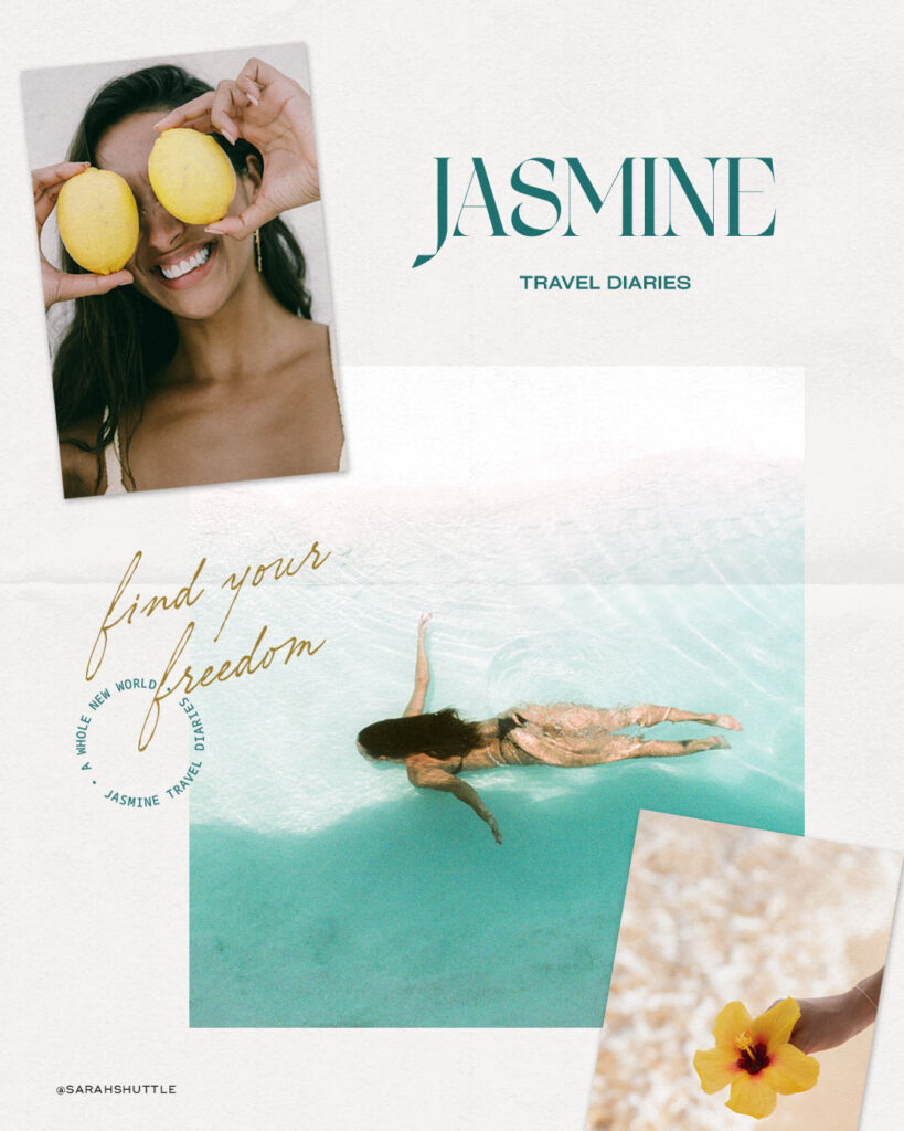
The second I sat down to create a brand for Jasmine, I knew she would be a travel influencer- after spending years stuck in her palace, she’d want to get out and explore the world!
To reflect this I chose a font with a tropical feel to it and ensured the colours were reminiscent of the outfits she wore in the film. I chose an elevated scrapbook-like feel to represent the brand so it felt like she was capturing memories.
And of course, I had to include the phrase ‘a whole new world’ in the sub mark as an ode to the iconic song!
The final result feels very fun and free: exactly how Jasmine would want to feel!
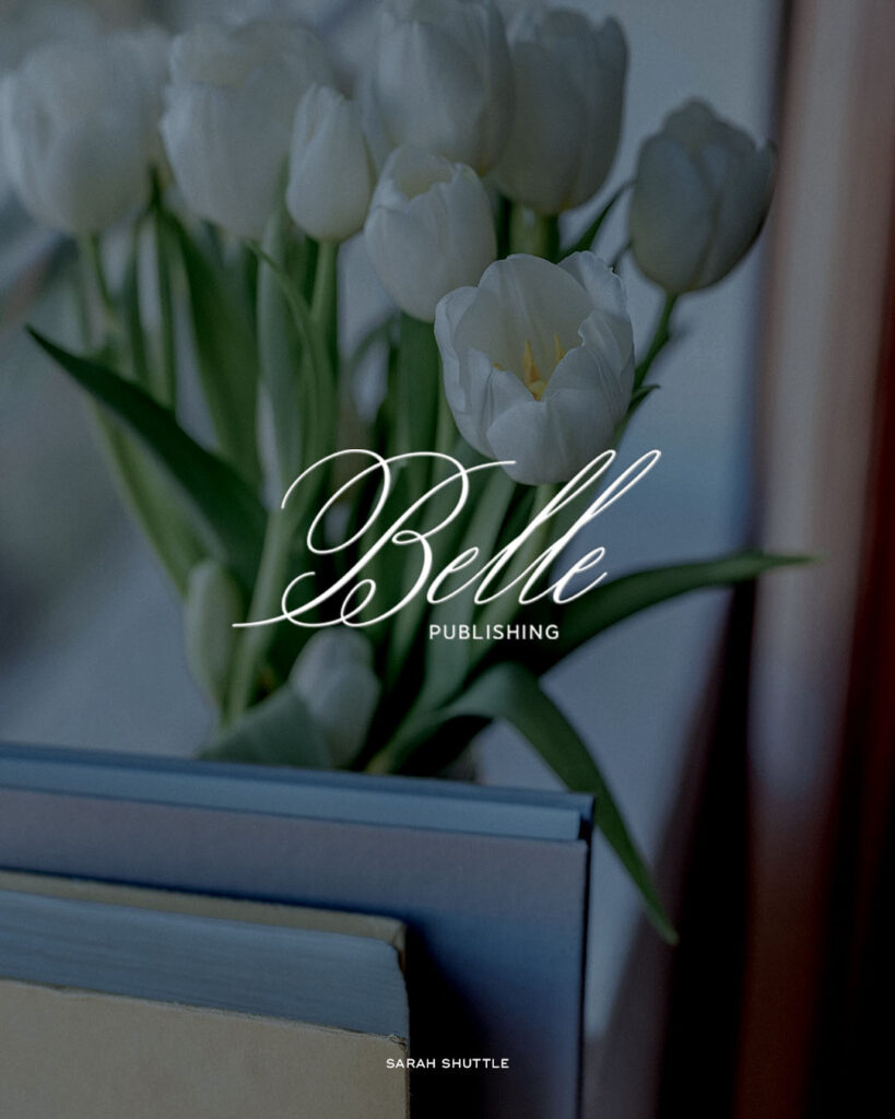
4. Belle: Publishing
With Belles’s love for books, there was only one career I could see her in; publishing!
I wanted the brand to reflect the ornate, french style you see in the movie and an old-style calligraphy font felt like the perfect choice!
It perfectly encapsulates the classic feel of the movie and reflects the same style font you see in books that start with ‘Once upon a time’.
Although the fairytale charm and poise make up a large part of Belle’s personality, I wanted to convey the fact that Bell handles herself very well (even dealing with the Beast) and could be taken seriously. So the classic white lettering paired with the dark wash of the photo, helped convey that professionalism I have no doubt she would have.
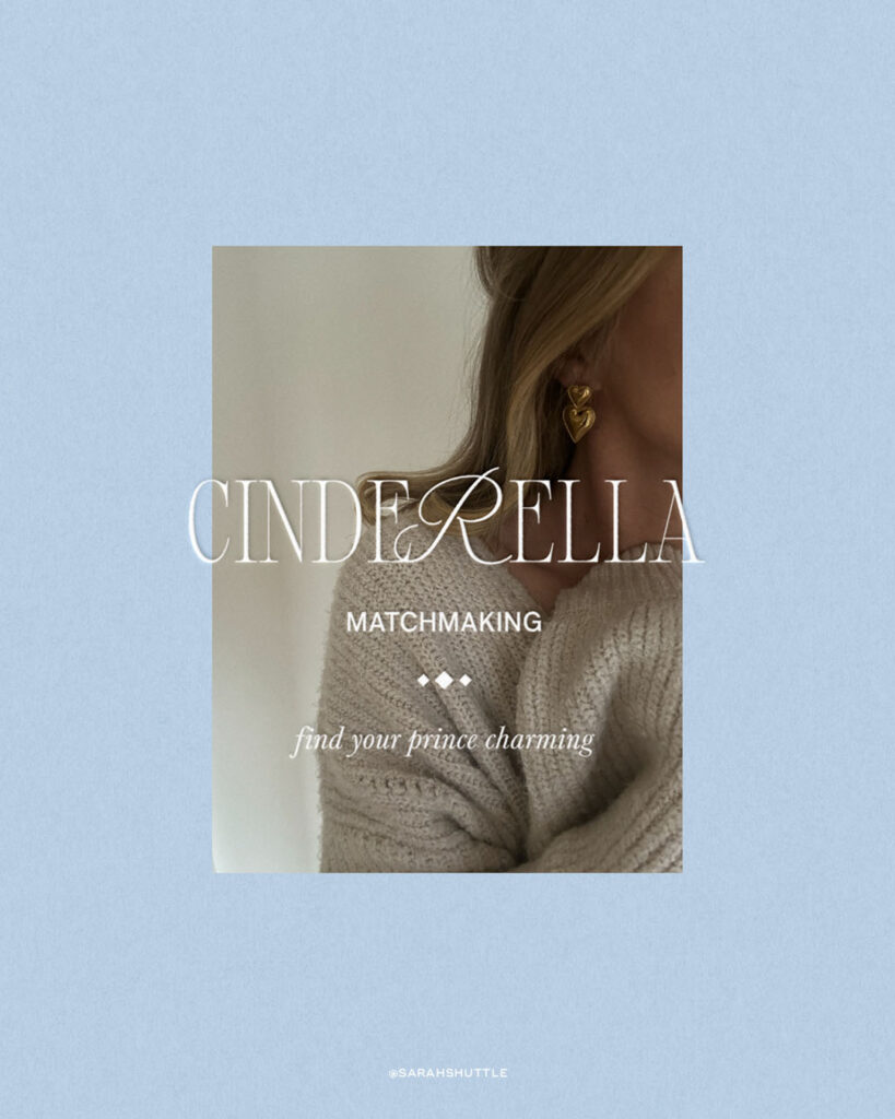
5. Cinderella: Matchmaking
She found her prince charming and now she’s here to help you find yours!
Of course, the colour scheme had to be blue to represent her dress but I didn’t want the branding to come across cold.
I wanted her branding to have a soft and welcoming feel as she’d need people to feel at ease with her since matchmaking is an intimate thing that requires a lot of trust.
Choosing an image with a girl with blonde hair (of course), in a cosy jumper with little heart earrings paired with a romantic font helped make sure the blue didn’t feel cold but instead, light and authentic. The overall result is a feminine brand that builds trust and hope.
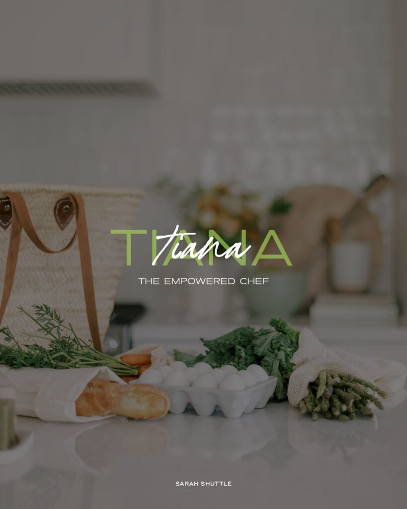
6. Tiana: The Empowered Chef
Tiana had to be a chef but that didn’t feel impactful enough. So I branded her as the Empowered Chef, because that’s exactly what she’d be!
For the design, I wanted to create something that reflected the duality of Tiana’s story and personality. On one hand, she’s a strong, independent and determined woman who fiercely chases after her dreams. However, when she turned into a frog, she slowly became more open to finding joy, and love and letting other people help her.
I represented this by choosing two different fonts and layering them! The bold font represents her as a human, and the script as a frog!
But this symbolism also reflects what it means to be a great chef. Yes, you need to be able to follow recipes and keep things structured (as represented by the bold font) but to make something special, you have to put your own twist on things and have a certain amount of finesse (as represented by the script!).
And as for the colour green…I think that’s self-explanatory!
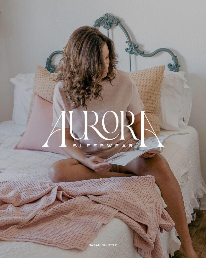
7. Aurora: Sleepwear
Since she slept for 100 years, I figured she’d be very big on making sure people are comfortable when they sleep…A ballgown can’t have been the most comfortable thing to sleep in!
This brand was all about the subtle hints to Aurora’s fairytale and story.
The font itself has been made to look like a bed with the ‘A’s at each end of her name acting as the headboard and footboard. Subtle, but effective.
I also took my time when finding the perfect background image. I ended up picking his one for several reasons. Firstly, the bed feels quite ornate which fits perfectly with the vibe I wanted her brand to convey. Secondly, the bed looks like it has vines growing over it, much like the vines that grew around Aurora in the film. Finally, the accent pillows and blankets are pink, just like Aurora’s dress!
The subtlety of each of these details and the perfect photo pairing brings the brand together in an effortless yet creative way!
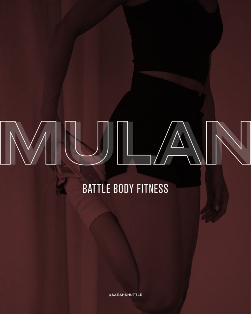
8. Mulan: Battle Body Fitness
With Mulan being the amazing fighter and motivator that she is, it felt fitting that she would own a Battle Body Fitness Studio!
I wanted the branding to reflect the sum of her influences in the film, so I wanted it to feel strong and powerful, just like her. Red seemed like a natural choice of colour because it’s a colour a lot of people associate with the film. In fact, it’s the first colour I thought of, even though I’ve never actually watched Mulan!
This just goes to show how powerful brand associations can be, which is why it’s important to make sure your branding creates the associations you want people to have.
I chose a modern, strong and energising font and the shadow effect reflects this.
Let me know what princess brand is your favourite over on Instagram and if you want me to work some Disney-level magic on your brand, enquire here!
With a soft spot for pretty things, old stories, history documentaries, and anything involving cats.
For over a decade, I’ve worked with creative, lifestyle-led founders to shape high-end brands that hold depth, essence, and story. Not just brands that perform, but brands that feel true.
Because before titles or industries, my clients are people. And the work begins there — listening closely, noticing what’s unsaid, and translating it into a brand that creates an inner shift and quietly elevates everything that follows.
Meet Sarah Shuttle. Luxury Brand Designer for founders across the globe…from London to Dubai, the Cotswolds to California
Your creative Partner
Whether you’re in the UK, US, Europe, or beyond, I bring the same blend of artistry, emotional intelligence, and strategy to every brand I shape.
My studio notes
LUXURY BRANDING EMAIL NEWSLETTER
in your inbox
Discover brand insights, beautiful things that have caught my eye, history tangents, and the occasional cat cameo. From one creative soul to another.